Page #27
Released
One may notice that in this page, the Human is wearing the same outfit as the last. The reason is that these two pages were originally drawn as one, but I scrapped that design, replacing it with two pages. The intentions of the original were experimental, and that experimentation was giving me trouble. Typically I use three-column layouts in Space House, but deciding it would be interesting to go for a greater number, I skipped four columns and cranked it up to five. Failing to preserve some of the original intentions in the final product, I opted to split the comic in two.
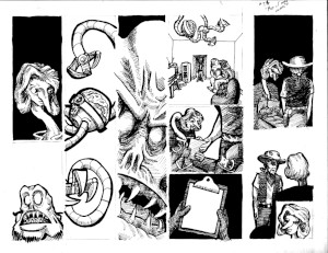
To give an idea of what the original version was like, here is the inked page, as I drew it on paper:

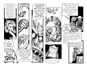
And here is approximately what it would look like as a finished product:

The main problem here is in the fourth column, where The Human walks in and hands Tharva the form. In order to allow room for the dialogue in the fifth column, these panels needed to be scaled down. However, in the version before compositional tweaks, the fourth column flowed nicely because of consistent scaling, and the size of the panels better emphasized what was going on. On top of that, the space between the fourth column and fifth seem awkward to me.
The way this page was designed left no room for scaling things down. The way this page was written, however, would require this. I drew it as if there were shorter lines, or as if I could get away with a smaller font size, especially towards the end of the page. It also took longer to even figure out how to resize things to make the final page as best as I could, and I'd rather not spend longer on that part of my process.
Furthermore, once I had the idea of making this two pages, I felt the whole thing would read better. Ending the first page at Tharva's reaction to being handed the clipboard sets up the next page, where the paper on the clipboard and her reaction is shown. It makes the pages more cohesive, which is a technique I'd like to explore more.
This said, I think that some of the original design decisions could work in a less verbose page of Space House. Less dialogue means less wrangling panels around for the sake of getting things to fit, so I don't regard the lessons learned here as absolute rules. But in conclusion, I would say that the final two-page version is better than the original one-page version, with the exception of the fact that The Human is wearing the same outfit in two mid-conversation pages. That simply doesn't make any sense.